University of Wisconsin-Superior Website Redesign

Streamlining the website experience to create more confident and informed users

The University of Wisconsin-Superior (UW-S) wanted a complete website redesign. The key challenge? The new site needed to encourage program and course exploration, facilitate applications, and create a better overall user experience – all while serving the many audiences that higher education institutions have. So, KW2 set off to build a visually exciting, intuitively organized site that conveyed tangible outcomes and endless possibilities for the UW-Superior community.

INSIGHT

KW2 conducted research with prospective and current undergraduate students to understand how they currently use the site, identify areas of user friction or barriers to completing key tasks, and determine opportunities for an improved site experience. Through this research and content auditing, we found that most core tasks had three or more possible success pages, which meant increased potential for duplicate content, conflicting information, and content maintenance issues. Prospective students also struggled finding in-depth content on the site. The primary goal in the website redesign was to improve navigation and streamline content to ensure audiences could find what they need.

ACTION

Through a careful, in-depth analysis of UW-Superior’s existing website, content was deleted, combined, and re-structured to give users a single destination for most tasks. This ensured users could find relevant content easily, and without second-guessing whether it was correct. Paired with a wholistic site redesign that modernized and reimagined the UW-S brand on pages, users now had an efficient, effective, and visual way to navigate the website and content areas.  

RESULT

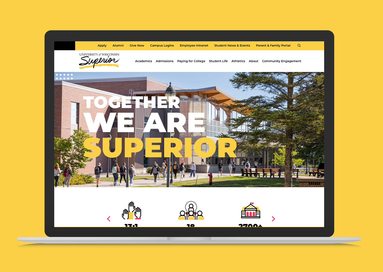
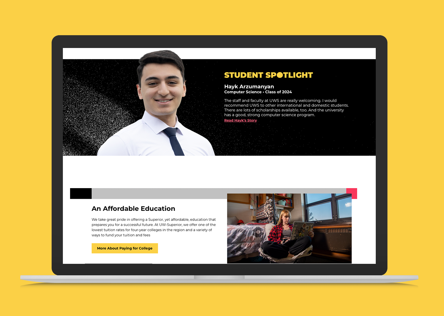
The new website is a dynamic digital compass, seamlessly guiding users through UW-S offerings and showcasing their impact. The redesigned site uwsuper.edu offers audiences a web experience that is built around their needs: Prospective students can search and land in the UW-S offering that is right for them. New promotional and content areas create various access points to connect with real UW-S staff. Real-world experiences like student life, campus tours, and events were brought to life online in engaging, interactive ways. Most importantly – educational jargon and other unwelcome barriers were stripped back from pages, allowing anyone to see themselves at UW-Superior.

Uwsuperior Case Study Screen Main
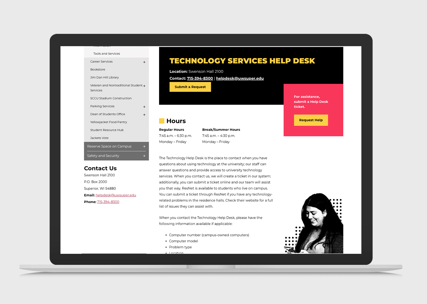
Uwsuperior Case Study Screen2

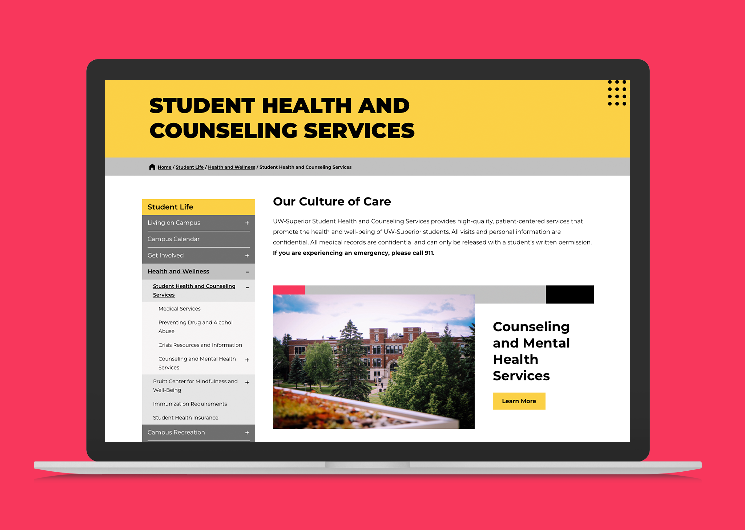
Uwsuperior Case Study Screen1